Goals (Tag Lines & Menus)

- Building a website is easy.
- Figuring out what you want to do with your career, that’s hard!

Ø Generalist
During your time in the School of Art you may have worked in many media:
- Painting & Drawing
- Graphic Design
- Fiber Art
- User Interface Design
- Illustration & Animation
- and more!
Having this breadth of experience is wonderful. But building a website to showcase so much diversity is not a great path toward being curated into a Gallery, hired by a Graphic Design shop or Animation Studio, or contracted to develop an Identity System or Shoot a Wedding. To do those things, you need a website that says you do exactly that.
Choosing is Hard
For many of you, choosing a career focus or goal can be hard. It might be hard to pick just one, and it can also feel like you’re killing your 5 other children.
Consider:
- Failure to make a decision can lead to paralysis
- Life is long & lived in chapters
- The "Best" is the enemy of the "Available Good"
Failure to make a decision leads to paralysis
Making a choice can be hard, but not making one can be devastating. You can always change your mind. You can always take a different path. But you need to pick something and commit to it.
Making a choice gives you a direction. The commitment gives you confidence. Failure to choose can leave you directionless. Every move is confusing and problematic.
Life is long and lived in chapters
You don’t have to do everything all at once. You don’t have to do everything right now. Across the years and decades of your career, you will probably do many different things. Making a choice now doesn’t mean you can’t make other choices later.
The Best is the enemy of the Available Good
We have a culture that talks a lot about Best, Perfection, Being #1. You can wait a long time for "Best" to show up. You might be better served by choosing the "Good" that’s available right now and seeing how far it can take you.
What’s in it for me?
Everyone looking at your site is asking,
What’s in it for me?
Your website should be answering this question!
Web Funnel
A "funnel" is a concept that your website should not simply be a random collection of content, but that it should be driving toward something. In our case, we’re driving toward contact from the Curator, Creative Director, HR Director, or Client we’d like to connect with.
At every moment on your website, a visitor can do 1 of 3 things:
- Decide that this isn’t it, and leave
- Decide that this could be it, and look more
- Decide that this is promising, and contact you
At every moment your website should be saying:
- Are you ready to contact me yet? Yes? – Here’s the contact button!
- Are you ready to contact me yet? Not quite? – Let me show or tell you some more.
Let’s be practical
Choosing your Career Goals and the Goals for your Website can seem like large and daunting decisions.
Let’s operationalize these big goals decisions as 2 smaller and more specific decisions that can give you clear guidance in collecting materials for your website and then in building it:
- Tag Lines
- Menus
Tag Lines
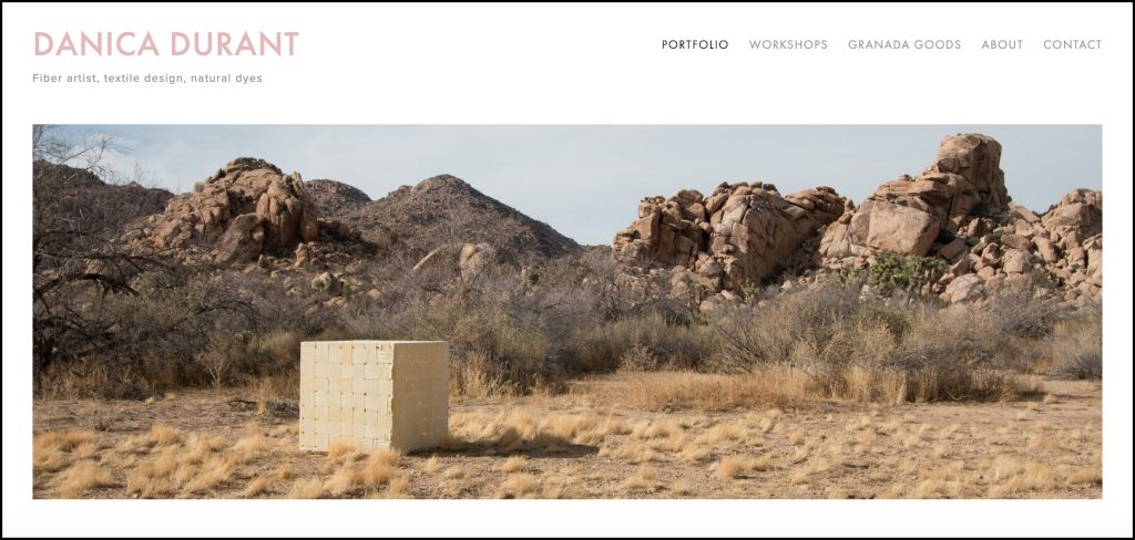
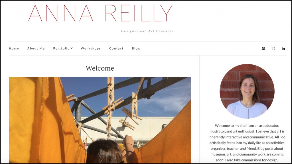
Your name doesn’t have to be huge on your website, but it should almost always appear in the Upper-Left or Upper-right.
Underneath your name in smaller, less bold, but still very clear type should be your tag line. Let’s make it completely and immediately clear what you do.
If someone does’t need you, that’s fine, let them off the hook. Even more importantly, if they do have an interest in your work, don’t make them hunt for the connection, make that clear right away.
For example:
VICKY MEURENT
painting
VICKY MEURENT
graphic design
VICKY MEURENT
fiber art & fiber art workshops
VICKY MEURENT
museum education
VICKY MEURENT
illustration
And so on. Say it right away. Say it right up front. Don’t make anyone look at your website for more than 2 seconds without knowing exactly what you do.
Making a Commitment
Again, choosing a Tag Line can be hard because we have many skills and we’re nervous about picking just one or leaving something out.
You can make multiple Category Pages or Archive Pages to cover multiple skills. That’s great. Art Galleries don’t hate that you also do graphic design, and graphic design firms don’t hate that you also paint, but to show in their gallery or get hired by their firm, you do need to make a clear and persuasive presentation that that’s what you do.
Website Menus
Once you’ve settled on a Tag Line, then express that Tag Line in your site Menus.
Your Menus are important site navigation, but they’re also an important outline of your abilities for your site visitors. Even without clicking on anything, they should have a good sense of what your work is about simply by reading all of your navigation choices.
ARTISTIC JOURNEYS
HOME – WORK – ABOUT – CONTACT
isn’t bad, it gets me around your site, but it does nothing to further explain your work.
VICKY MEURENT
graphic design
HOME – BRANDING – PACKAGING – TYPOGRAPHY – ABOUT – CONTACT
Or
VICKY MEURENT
performance art
HOME – PERFORMANCE – INSTALLATION – PUBLIC ART – SITE-SPECIFIC WORK – ABOUT – CONTACT
gets me around even better, and, even before I click, it tells me a lot more about what you do. It’s a much more informative and compelling way to introduce your work.
Get Your Art Above The Fold
Back in the days of newspapers on racks, the front page was folded in half. You could see the top half through the rack window and the botttom half was hidden "below the fold".
Being on the front page was good, but being "above the fold" was even better.
We use the term Above The Fold on the web to mean the top content on your site that we see before having to do any scrolling.
VICKY MEURENT
graphic design
HOME – BRANDING – PACKAGING – TYPOGRAPHY – ABOUT – CONTACT
is a great intro to your work, and it’s also very compact. Just Name, Tag Line & Descriptive Menu says so much about you and lets visitors connect quickly to you.
After you’ve said that, get some art above the fold!

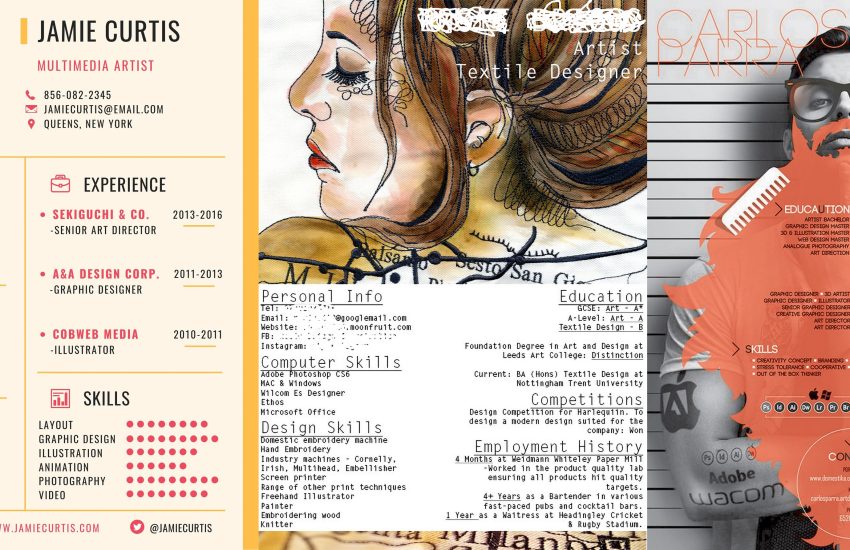
Featured websites:


One thought on “Goals (Tag Lines & Menus)”