Ellsworth Kelly’s Green Angle, 1970, is hung wrong at The Broad Museum
Ellsworth Kelly’s Green Angle
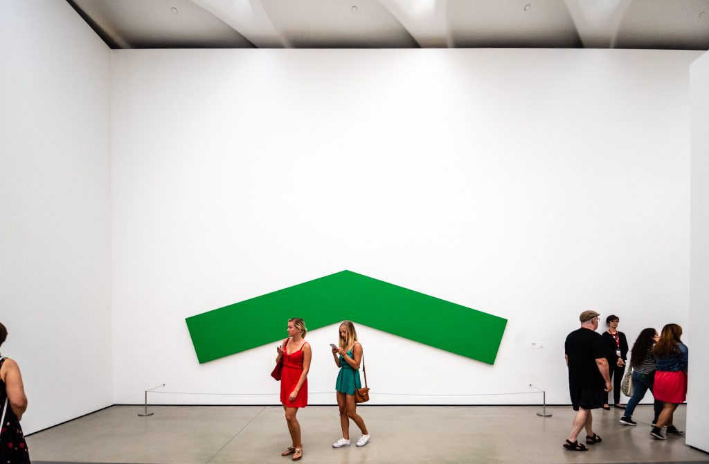
Ellsworth Kelly‘s Green Angle is one of the largest works at The Broad Museum in Downtown Los Angeles. It is also unique in that it is a work of pure figure, relying on the architectural interior for ground.
Figure & Ground
Most of the paintings hanging in The Broad Museum, or in any other museum, gallery, home, or office have one thing in common: representational, abstract, or diverse in any other way as they may be, they tend to contain figure and ground on the same panel.
Some of Ellsworth Kelly‘s paintings are different. With some, Kelly creates a canvas of pure figure. These works rely on the architectural interior to supply the ground of the visual experience.
The way a painting is hung can be more or less helpful to the experience of the painting. Still, when a painting contains both figure and ground, even a crowded hanging can permit the viewer to enter the world of the painting and experience what they might there.
Since some Kelly paintings require the architectural interior for ground, when one of these Kelly’s is hung wrong it isn’t simply less ideal, it robs the painting of its rhythm and power.
Diller Scofidio + Renfro
The Diller Scofidio + Renfro design for The Broad Museum was dubbed the veil and the vault because the building houses both exhibition and storage areas:
… the museum’s design merges the two key programs of the building: public exhibition space and the storage that supports The Broad Art Foundation’s extensive lending activities. Rather than relegate the storage to secondary status, “the vault” plays a key role in shaping the museum experience from entry to exit. Its heavy opaque mass is always in view, hovering midway in the building. Its carved underside shapes the lobby below and public circulation routes. Its top surface is the floor of the third-floor galleries. The vault is enveloped by the “veil,” a porous, honeycomb-like exterior structure that spans across the block-long third-floor gallery and provides filtered natural daylight.
— dsrny.com
We’ll build you an elevator, but we won’t hang you properly
Visitors to The Broad Museum in Downtown Los Angeles are often told that a core element of the museum’s architecture, the size of is freight elevator, was designed specifically to accommodate the large 17.78 x 5.867 m dimensions of Ellsworth Kelly’s 1970 oil on canvas work Green Angle.
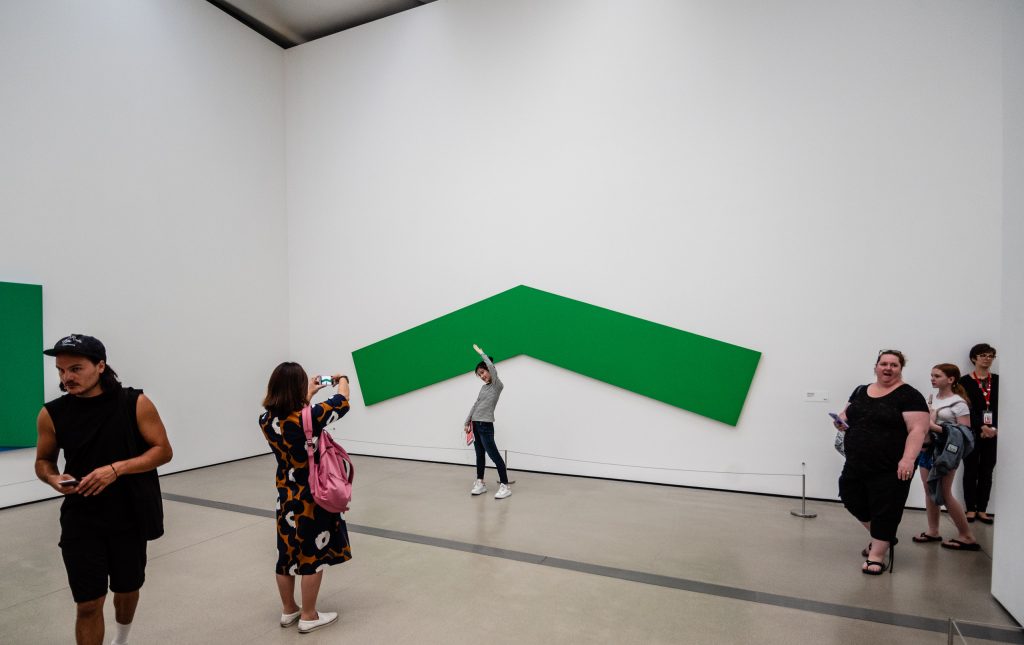
The Broad built its freight elevator for Green Angle. Unfortunately, The Broad seems unwilling to hang Green Angle optimally. In my judgment, this work is hung too low. The low hanging refuses to allow Green Angle to resonate with the DS+R architecture. Instead of dancing with the interior architecture, Green Angle is tied down low like Gulliver by so many Lilliputians who cannot conceive of the work beyond its use as a selfie background.

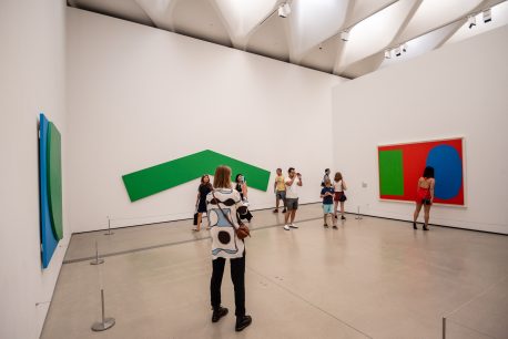
Kelly’s nearest neighbor at The Broad Museum is Ed Ruscha’s Norm’s La Cienega on Fire, 1964. Like most paintings, Norm’s La Cienega on Fire contains both figure and ground and therefore is largely impervious to how it is hung. Given ample space as shown here, or hung Salon style in a cramped gallery, the figure, ground, and overall experience of Norm’s La Cienega on Fire would be largely unaltered by the hanging.
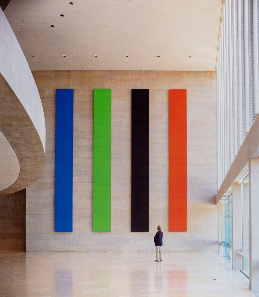
Blue Green Black Red: The Dallas Panels, 1988, Ellsworth Kelly, site-specific painting,
Morton H. Meyerson Symphony Center. Image: Artstudio magazine no. 24, 1992.
Architect I. M. Pei commissioned Kelly in 1985 for the Raffles City building in Singapore and again in 1988 for the Morton H. Meyerson Symphony Center in Dallas. For the Meyerson, Kelly created the 10.3 x 9.5 m work Dallas Panels (Blue Green Black Red)
When Kelly is hung well, as in Dallas Panels in the Meyerson lobby, his all-figure painting comes alive against the ground of Pei’s architectural interior.
If Dallas Panels at The Meyerson is the zenith of presenting Kelly’s work, Green Angle at the Broad is the nadir. Denied the architectural interior it requires for ground, Kelly’s Green Angle is robbed of its ebullient nature and becomes merely a brightly colored Instagram background.
Hung for Instagram
On a visit to The Broad I asked a VSA (Visitor Services Associate) if he thought Green Angle was hung too low. His reply was a question:
You know the whole museum is hung for Instagram, right?
The VSA explained that the overarching criteria for all curatorial work at The Broad is how it works for Instagram selfies.
He went on to describe The Broad’s Influencer Events. Occasions when Instagram influencers with over a certain number of followers are given exclusive access to the museum and any assistance necessary to manufacture ideal selfies.
He also stated that when the museum was first opening, he had suggested having one day a week of no cameras allowed, in hopes of fostering a more present appreciation of the work. As he noted, obviously, we didn’t go that way.

Let it breathe
It’s probably not realistic to expect Kelly’s gallery at The Broad to be any bigger than it already is. But Green Angle doesn’t have to be hung so low. Can’t one painting escape the limitations of Instagram?
Broad Curators: I encourage you to try hanging Green Angle higher. Also, the ropes around the painting which strive to preserve the work for the future, rob it of the present. Because this work is so sensitive to architectural interiors, the ropes become a distraction from the purity and power of the work. If you hang the work higher, perhaps you can also try removing the ropes for a while.
Ellsworth Kelly’s Green Angle is a sublime masterpiece. I dream of one day viewing it in its full power and glory.

Awesome post, I will present this to my Intro to Visual Art class. Thanks!
Thanks, D! Where do you teach? I’m at Long Beach State University.