Connor Sinclair
Hey Connor,
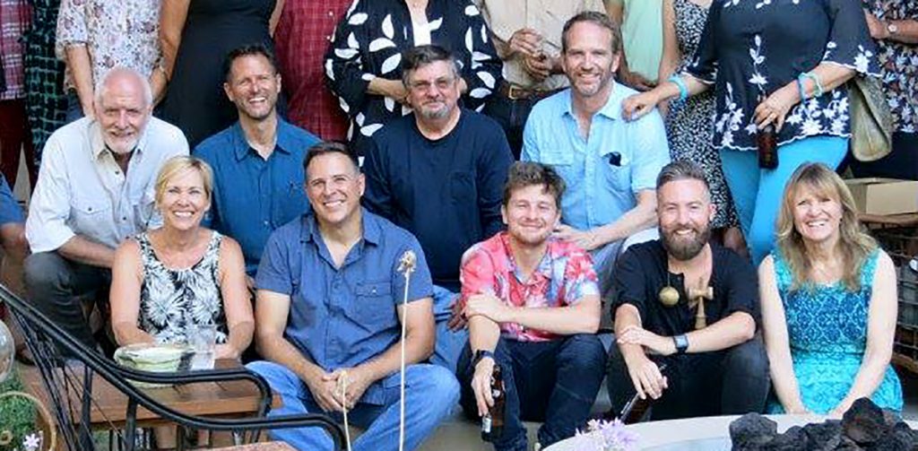
It was nice meeting you at your dad’s reunion party on Saturday!
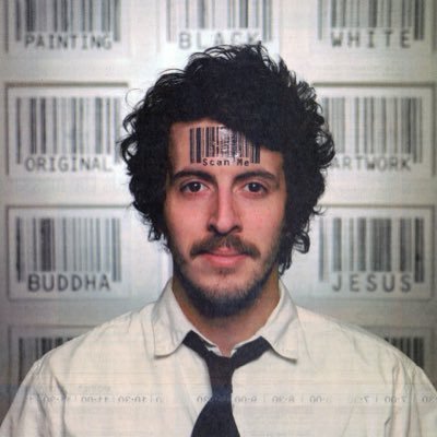
That’s great that you went to SCAD. I’ve never been down there. My first introduction to SCAD was Scott Blake, although I got the impression that he was a far from typical SCAD person.
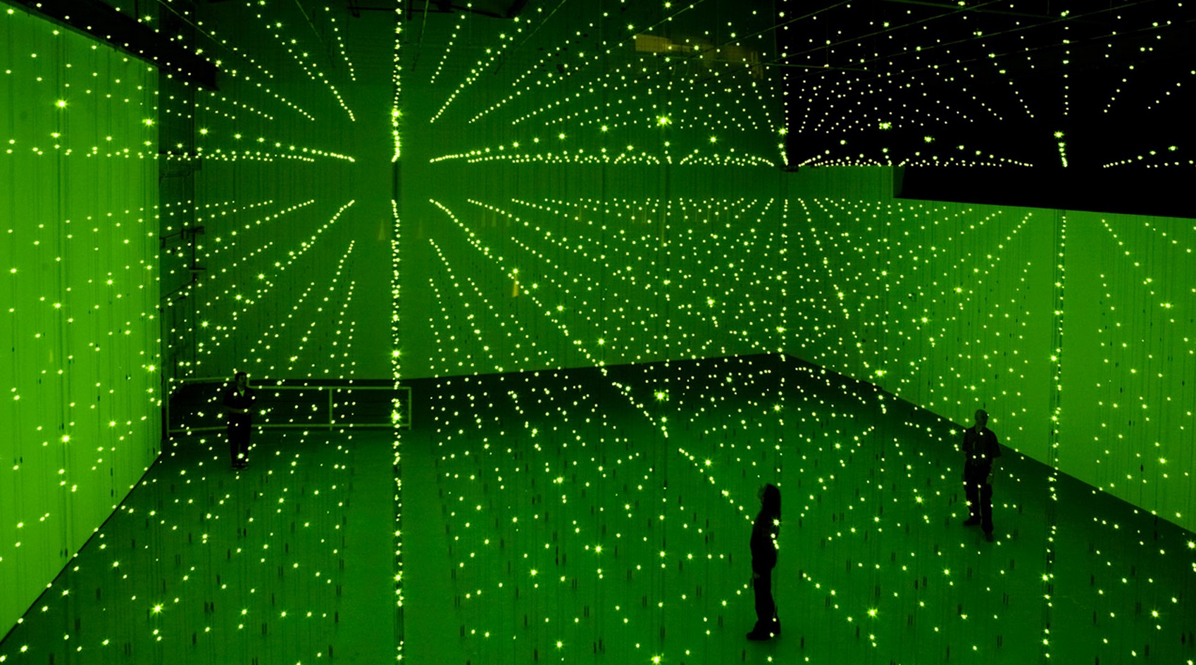
Also pretty cool that Marc Jacobs used to hang out down there! I’m still enamored with his Louis Vuitton Spring/Summer 2013 collection. Or actually, the fashion was pretty interesting, but the runway show where it was staged with Daniel Buren’s production design, that was really it for me! 🙂
I was enamored with geometric abstraction for years! Ellsworth Kelly, Bridget Riley, and all the usual suspects. The work Buren’s been doing in recent years seems to tie those old traditions with very contemporary sensibilities.
The Ambassador to the Fractal World?
During the latter part of my DEAD time I started thinking about fractals. About the life inside the image. About the image inside the image.
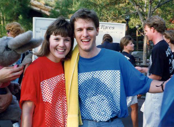
During the summer Disneyland had Canoe races between teams of cast members. Pretty early. Maybe 6am? Or earlier? All before the park opened. They had 3 divisions: men’s, women’s & coed. In the summer of 1988 I put together a DEAD men’s team. We got killed!
Then in the summer of 1989 I put together a coed team. We did pretty well. We wound up finishing 4th out of 79 teams. Earlier in the year, Kevin had been on tour with the Disneyland Ambassador to the World. Every year Disneyland would pick an Ambassador and they’d go off doing promo tours. That year the ambassador was Wendy Freeland. After a trip to Australia, Kevin came back with an Australian newspaper that had a picture of Wendy and the characters on the front page.
As you might know, newspapers, and just about all materials printed by processes like lithography, use halftones as a process to achieve a continuous tone image from a limited range of ink colors. Like a greyscale image from just black ink, or like a “full color” image from just CMYK ink colors. Fine art books tend to use very fine halftone screens that are hard to notice with the naked eye. Newspapers, printed on cheap newsprint, use much coarser screens.
What was so cool about the newspaper photo of Wendy that Kevin brought back was that the Australian newspaper used far coarser screens than any American newspaper I’d seen. So as I was putting the canoe team together I was blowing Kevin’s photo up on a copier. The team that year was mostly DEAD peeps: lightweights like me or Jenny, and powerhouses like Rich or Marie. But we also had a few DEAD Friends as team members, like Karin Hendricks from Show Services.
Somehow my brain found its way to the nexus of the Canoe Team and the Giant Pixelated (halftoned) Wendy. I asked Wendy if she’d be on our team and she graciously accepted. We subtitled this incarnation of Schmooz & Destroy The Ambassador and the Art Slime and printed the shirts you see Wendy & Kevin wearing. In your designer choice of Red, Blue or Black! The team did pretty well.
After leaving Disneyland in ’92 I went on to make lots of paintings in this style. In an early experiment I made a fractal screenprint of DEAD Office Person Beth Syverson (Clements) made out of many thousands of tiny Beths. Then a selfie, of me composed of many thousands of tiny images of my mom and dad.
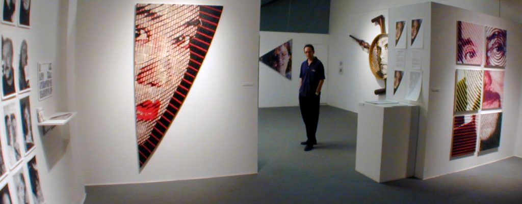
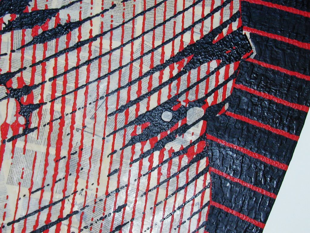
When I was really into this work I used to give slide talks. I’d show one of those “lozenge paintings” from Chuck Close, and then I’d show a really close detail of a few of the lozenges and then click on to the next slide. Then I’d back up to the detail and say,
Oh, by the way, I just lied to you. Do you know what it was?
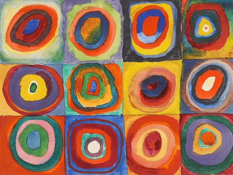
And then I’d explain that the slide wasn’t a detail from a 1993 painting by Chuck Close, but the entirety of a 1913 painting by Wassily Kandinsky.
Fair Use?
Weirdly enough Connor, the stories I’ve just told you connect. After making Bar Code Art for a few years, Scott Blake moved on to the creation of his Chuck Close Filter which he made publicly available on his freechuckcloseart.com website.
What Blake did was to dissect Chuck Close paintings into the many thousands of tiny lozenges Close fills his canvas grids with. Then you can input a photo of your choice: a selfie, a friend, a loved one. Or maybe Kim Kardashian. Blake’s filter would do a density and color matching scan across the tiles or pixels of your image, and then through his library of Chuck Close lozenges/pixels Blake’s algorithm would assign “Chuck Close Pixels” to the values of your source image. It’s somewhat analogous to the work that Rob Silvers did with his Photomosaics. Except that where Silvers might make a portrait out of tiny pictures of Pink Flamingos or 747 Jumbo Jets, or International Currencies, Blake used as pixels tiny pictures of Chuck Close lozenges.
Blake’s “service” was free online. Anybody could visit the website and generate a .jpg to print at home. Obviously not a glorious Chuck Close canvas, but an interesting way to think about fractal, or pixelated, art accretion processes. Especially in the context of the remix generation.
Interesting anyway until Chuck Close sent Blake the angry, all caps email threatening to sue him off the face of the earth for destroying his livelihood, his legacy, and his children’s inheritance. A bunch of lawyers told Blake that if he tried to fight the lawsuit from the wealthy painter, it could easily cost him a quarter-million dollars if he won. And presumably more than that if he lost. So Blake ceased. And desisted.
My Chuck Close problem: Scott Blake at TEDxOmaha
I’d been pretty enamored with Close’s work in the mid-90’s, but by the mid 00’s I was thinking about other things. When he threatened to use the nuclear option on a younger generation, he started to feel pretty stale to me.
Given his life challenges, it’s probably a little crass to be down on Close and what he’s achieved. If you’re familiar with his work you might know about his “spinal incident”, and his extremely limited mobility. It’s remarkable that he recovered and has made so much work. As one not-so-kind CSULB faculty member once said of Close’s lozenge-on-a-grid paintings, “it’s the only work he can make at this point.”
What I think is so fascinating about Close’s spinal incident and the work he made after it, or Claude Monet’s cataracts and the work he made after them, is that they were already headed that way for years. It’s easy to look at Close’s physical limitations or Monet’s visual limitations and use that to justify the work they made after it. But amazingly, the work they made before these “losses” was solidly along the trajectory to the work they made later. So the physical condition didn’t “cause” the work. I sometimes wonder, at least poetically, if the work caused the physical condition. If they somehow evolved their bodies to be more ideal machines for making the type of work that they had dedicated their creative powers to.
Kendama
So much for SCAD Alumni spitting on the art world, and DEAD peeps paddling up the river!
Sorry I didn’t get a chance to play with your kendama. I don’t think I’ve ever actually messed with one. Is it fun? How good are you? Is it as ridiculously hard as it looks?

Late that night Linda was feeling inspired to hold another DEAD Party, and wondered what would be fun to do there? Maybe a bunch of kendama and have some sort of, uh, kendama event! Or challenge, or something?
Saturday was a pretty fantastic party. For me, of course, it was seeing peeps I haven’t seen in 24 years. I wonder what it was like for you Connor, since I presume you never worked there! Did you already know a bunch of peeps? Like Linda & Chris? Or was it mostly new peeps to you?
Anyway, what was your sense of it? What would be fun to do at some 2017 version? Kendama? True Confessions?

image: Kawaii Kunicorn

Or maybe we could build a miniature theme park, give everyone a plush toy avatar, and then collect points by having your avatar conquer attractions and challenges?
And by miniature theme park, I know we have a lot of genius overachievers in the group, but I think an ice bucket would suffice for Splash Mountain, and so on. So your plushvatar could brave the ice bucket challenge and go forward.
Typographic Design
Where can I see some of your typographic design Connor? I’d love to see what you’ve been up to and hear about your influences!
Back in 1991 DEAD got a copy of Fontographer. I passed out the 26 upper case letters, 26 lower case letters, 10 numerals, and I don’t remember if we did special characters or not. Everybody designed letters and I assembled them in a font we called Anaheim ’91. Hmm… I wonder if I still have a copy of that anywhere?
What else?
What else is on your mind Connor? What’s interesting? What’s fun?
It was really nice meeting you at the party. Have a great rest of summer. Keep cool!


