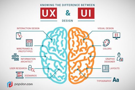

Designing Interaction
This week we’ll look at User Interfaces. At the way we interact with digital tools. We’ll do this in 2 parts. First, you’ll critique someone else’s work. You’ll consider what about the design of this interface makes it fun or easy to use, and what about this interface makes it frustrating, hard or confusing to use. Second, you’ll give a try to designing an interface of your own.
UI Critique
Pick an interface. Something like a mobile app, or a website. It could also be a specialty device, like a hand-held GPS unit, a watch, or the dashboard of your car. It might be one that you use all the time or one that you’ve never used before but are curious about. Either way, play with it for a while. Whether you mostly like, or mostly dislike, this interface, try to find some things that it does well and some things that it could do better. Yes, you can critique glenn.zucman.com/i2va if you want to.
- Take a picture of one or more of the screens. Or if it has physical controls, like an analog sound mixer, then take a picture of that.
- Describe 2 things that this UI does well.
- Describe 2 things that this UI does poorly and how they might be better.
In your critique, focus on aspects of the Interface. If it takes 3 clicks to get to a screen that you use all the time, then that’s a point of “pain” or “friction” that might be improved on. But if the fortune telling website’s fortunes are always stupid, or always wrong, that’s not really the interface’s fault, that’s just poor content. In your critique, don’t focus on the content, focus on the strengths and weaknesses of the User Interface.

Design a UI
Now it’s your turn. Design a User Interface for something. It might be a mobile app. Or a website. Or some other useful thing. It could be a small hand-held device that’s useful to someone on a hike, or to someone taking store inventory, and so on. If it’s an app or website that runs on existing phones or laptops, you’ll design how people navigate through screens, virtual buttons, and so on. If you design a new object, you can also think about what makes it easy to use: the way it fits in your hand, or on your wrist, etc. it could have physical buttons, knobs, etc, that make it easier to use than having to go through screens and menus.
If you create a virtual tool like an App or Website, draw at least 2 screens. Use any drawing media you like: pencil & paper, computer drawing or sketching tool, etc.
If you create a new device, you could also draw it, but you might think about making a very simple version of it out of something like a piece of foam. Very simple test objects, also known as Rapid Prototypes, don’t have to work, you can use them yourself or ask others to use them and just imagine how they’d function when you’re on your hike, or taking store inventory, etc. Rapid Prototyping is a great way to begin to think about the User Interface and User Experience of the device you’re trying to design. The idea is to make something fast & cheap that can get you some information so you can iterate on a new version quickly.
On your website, include the images of your UI, descriptions of how it functions, and why you believe it will be easy, fun, or convenient to use. You can describe how you think it will be better than other interfaces. You can describe concerns you have about aspects that might confuse or slow down users. You can also describe aspects of the experience that you just aren’t sure about yet, but would like to learn about if you went on to do user testing.
Have fun!